We asked our Artist of the Month Akhilesh Narayana to create a new DIY tutorial for you all and he did not disappoint! He has put together this layered calligraphy background project for you that will really make your calligraphy stand out.
This tutorial is perfect for intermediate skill levels to really create the wow factor!
So, what are you waiting for? Get your pens ready and lets go!
What is your background and when did your passion for Calligraphy and Lettering begin?
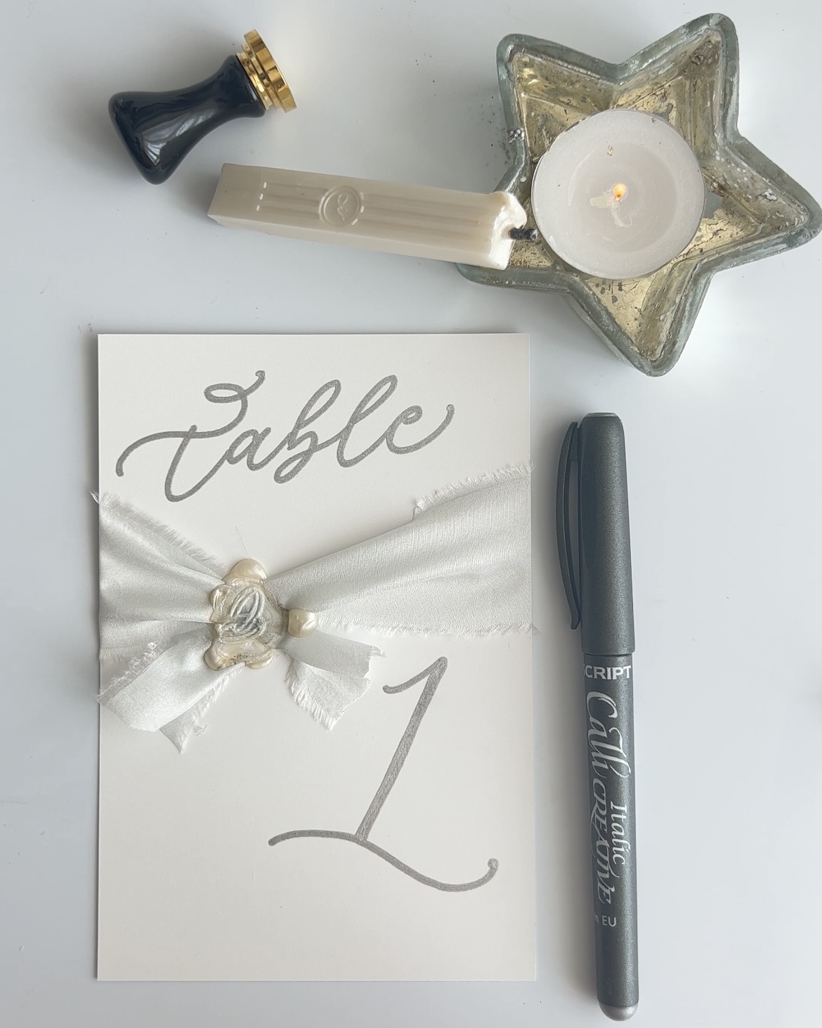
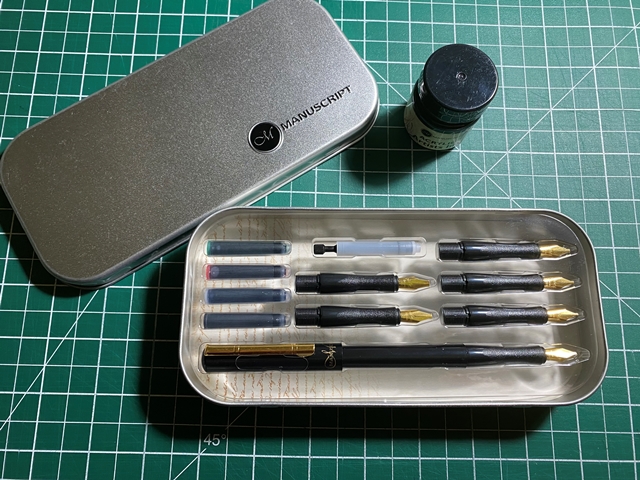
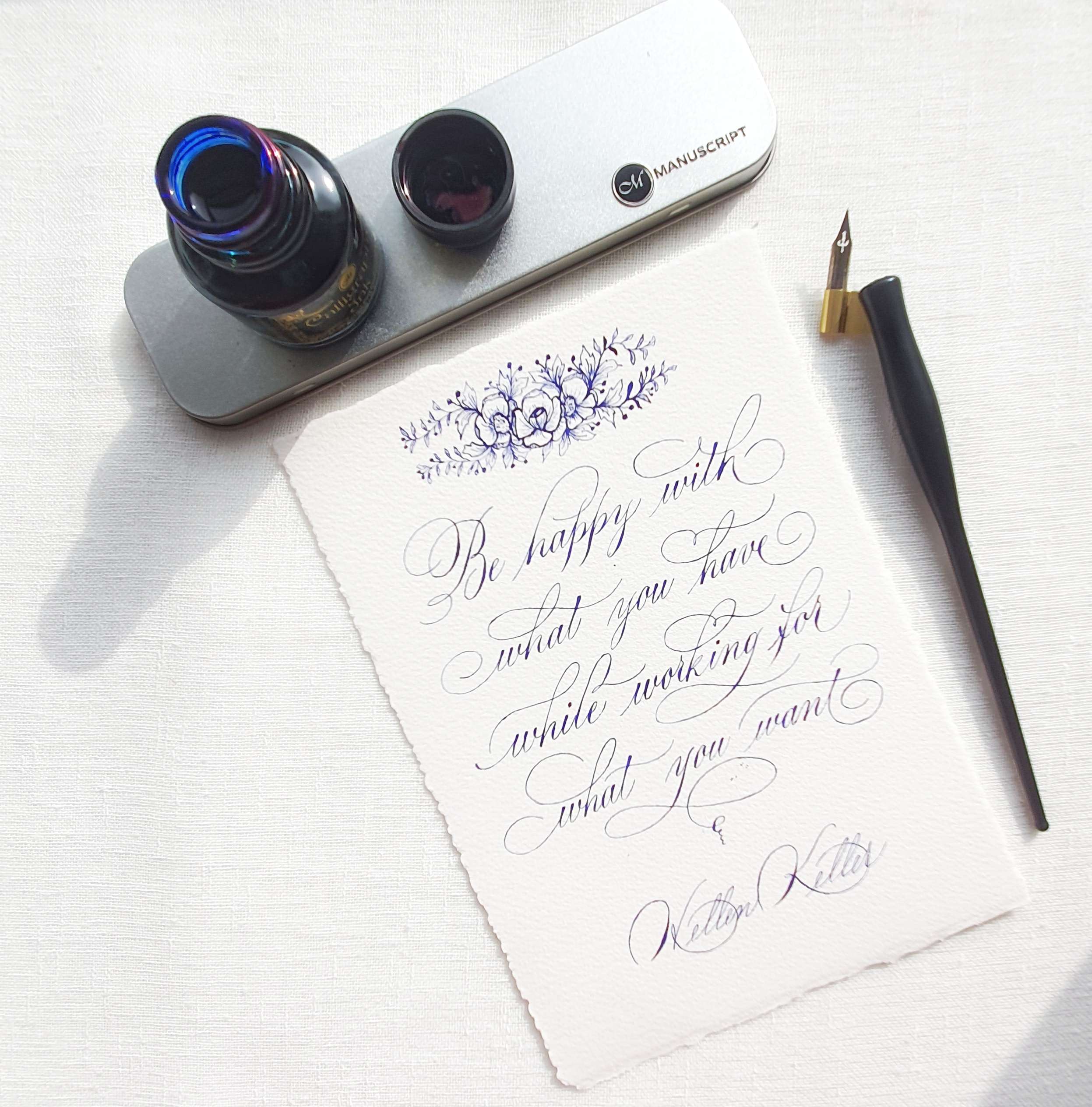
The Tools you need to get started:
- Poster nib
- Roundhand nib
- Ink colour of your choice
- Cold pressed watercolour paper
- Ruler
- Pencil
- Eraser
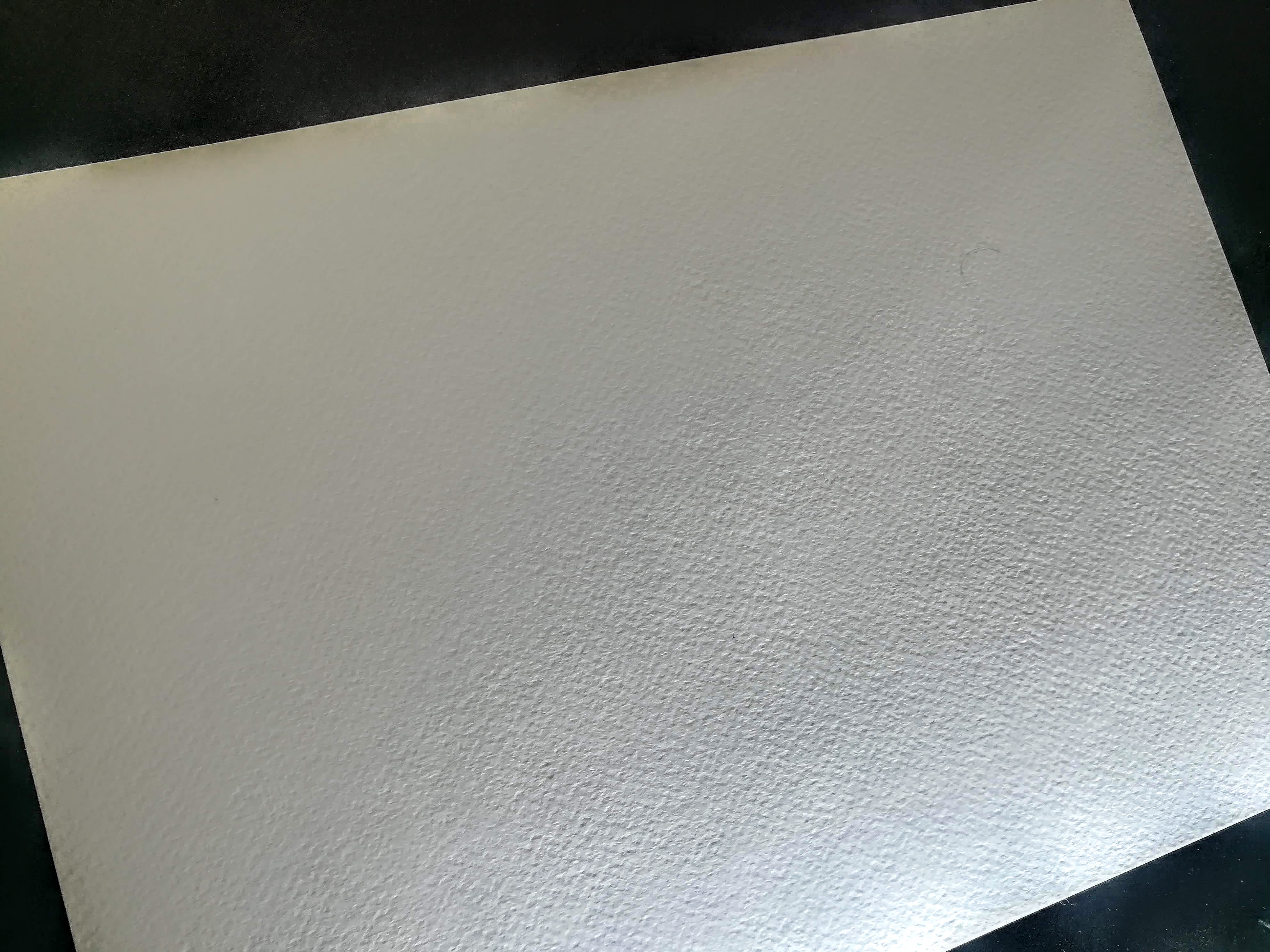
Step 1 - Paper Selection
For this project it is important you choose the correct paper, especially as you will be adding layers of calligraphy. We have used a 200gsm cold pressed water colour paper in an A4 size.
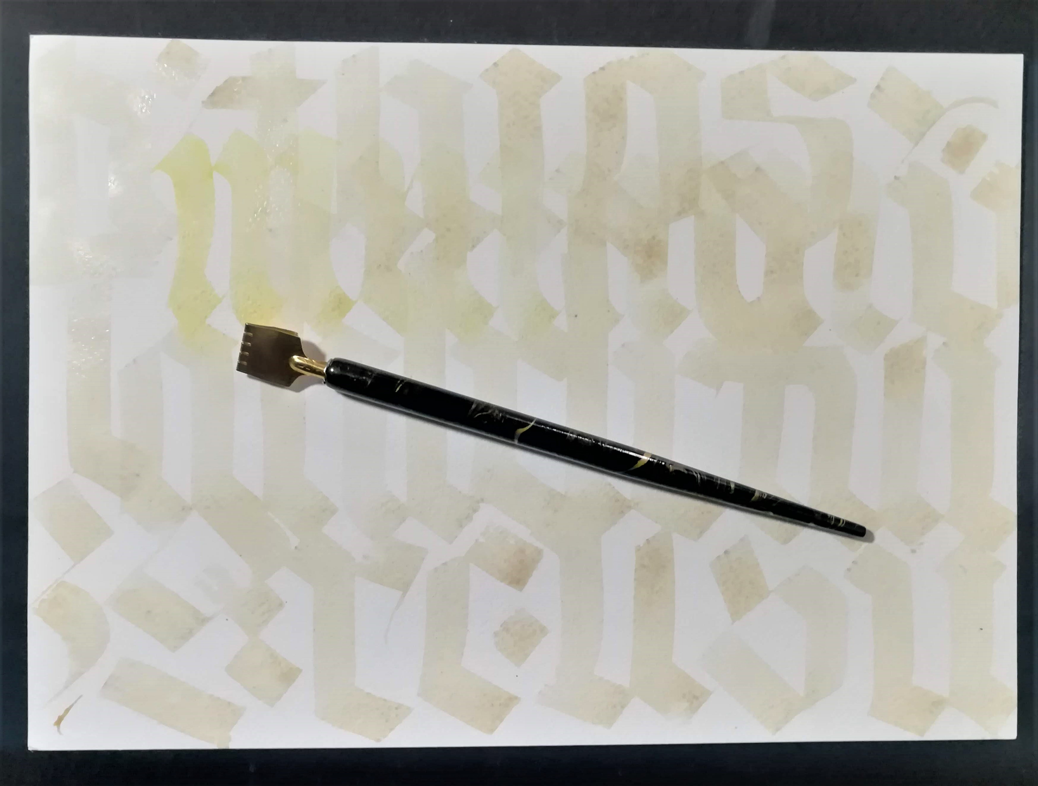
Step 2 - Create your first layer
For the first layer we used a walnut ink but diluted it down to make it lighter. As you are creating the first later for the background any light shade of ink can be used. Take your Poster nib to create large and medium sized letters in a horizontal direction. Remember to keep it relaxed to create a understated effect.
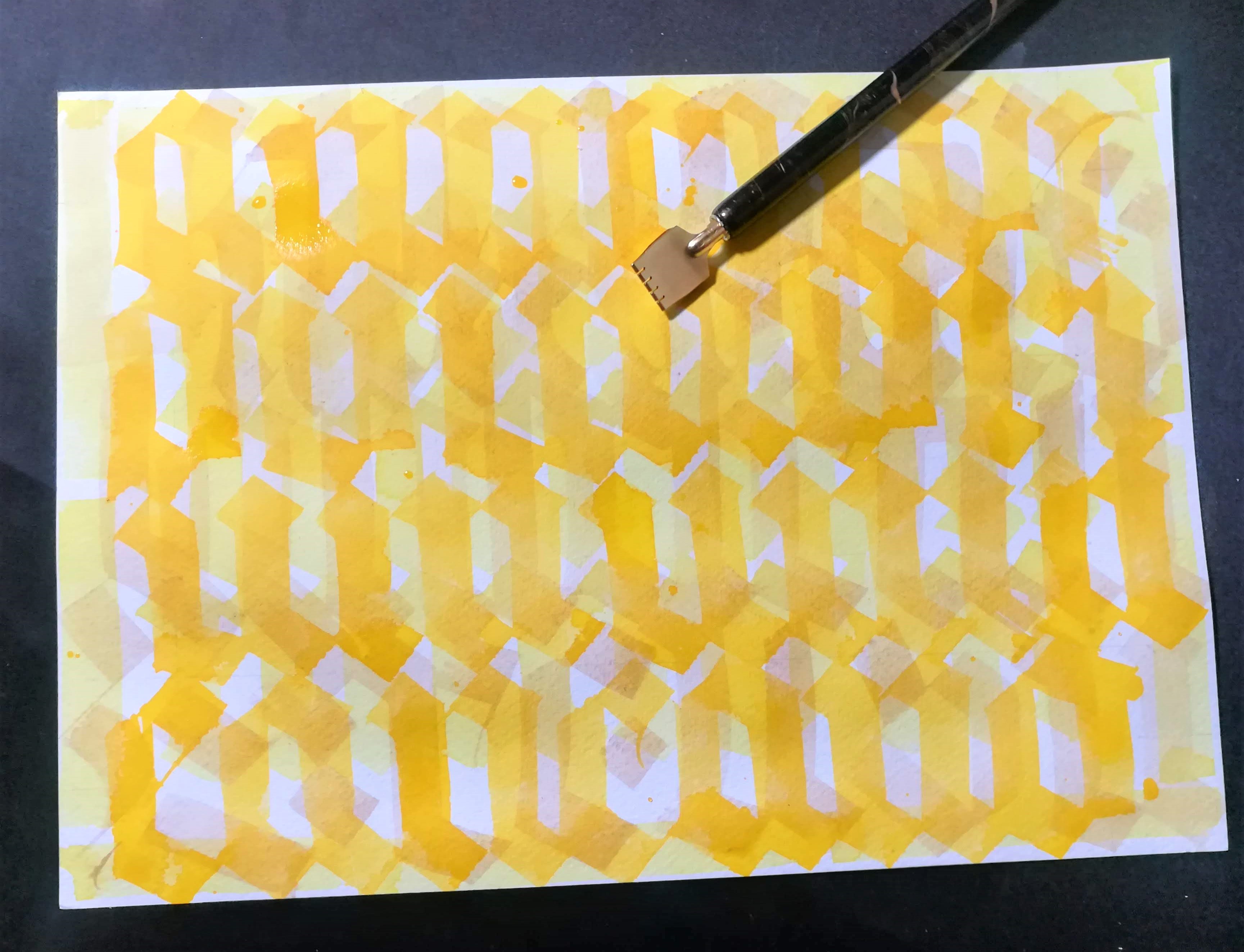
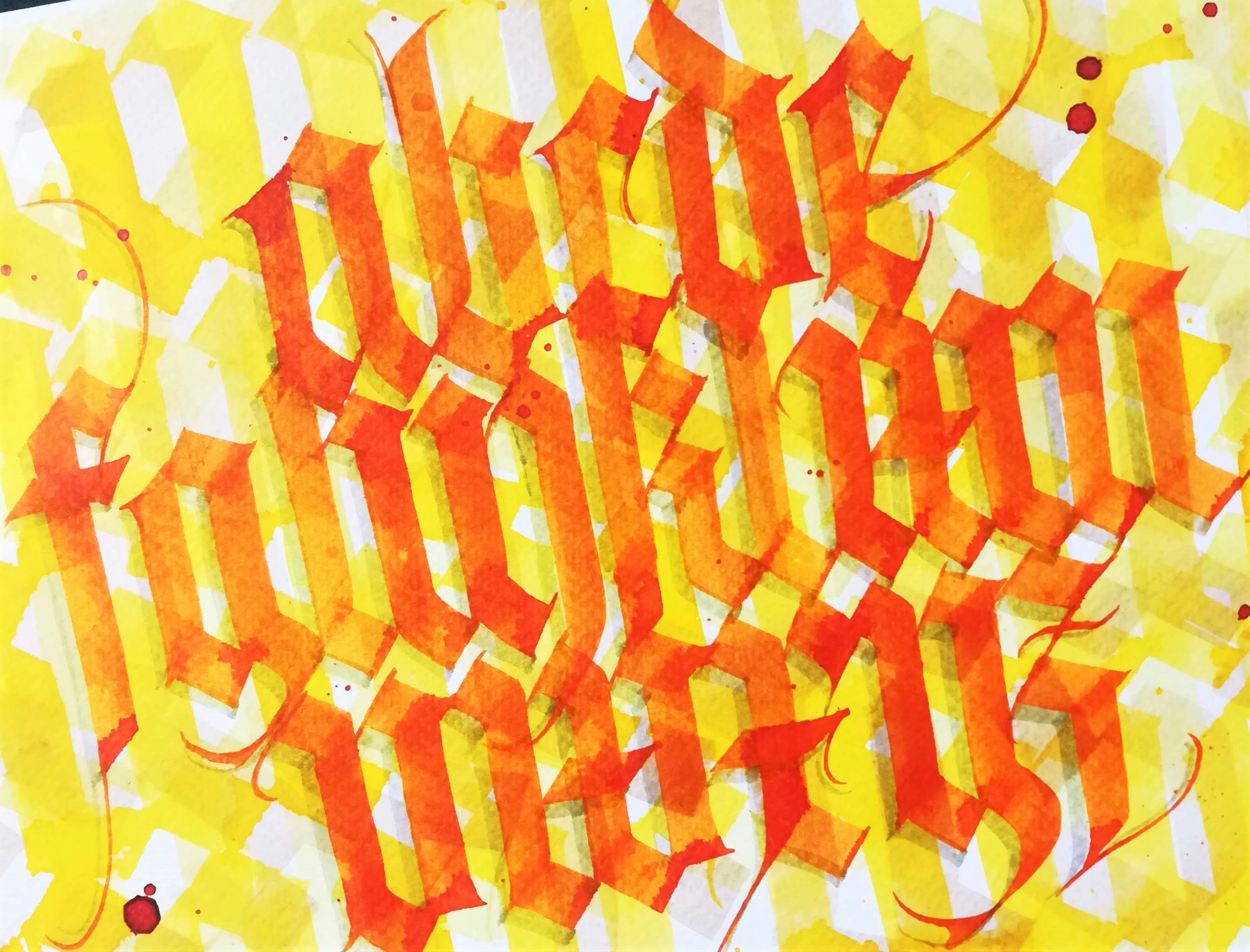
Step 3 - Create additional layers
Next, for second layer we used a yellow ink and again diluted it down to get a light shade but darker than layer 1. Its important you use similar colour tones for your layers to created this "3D" effect. Repeat this process by adding a darker layer, and then another darker layer. Stop when you are happy with your layered effect. Here is the comparison of the layer effect:
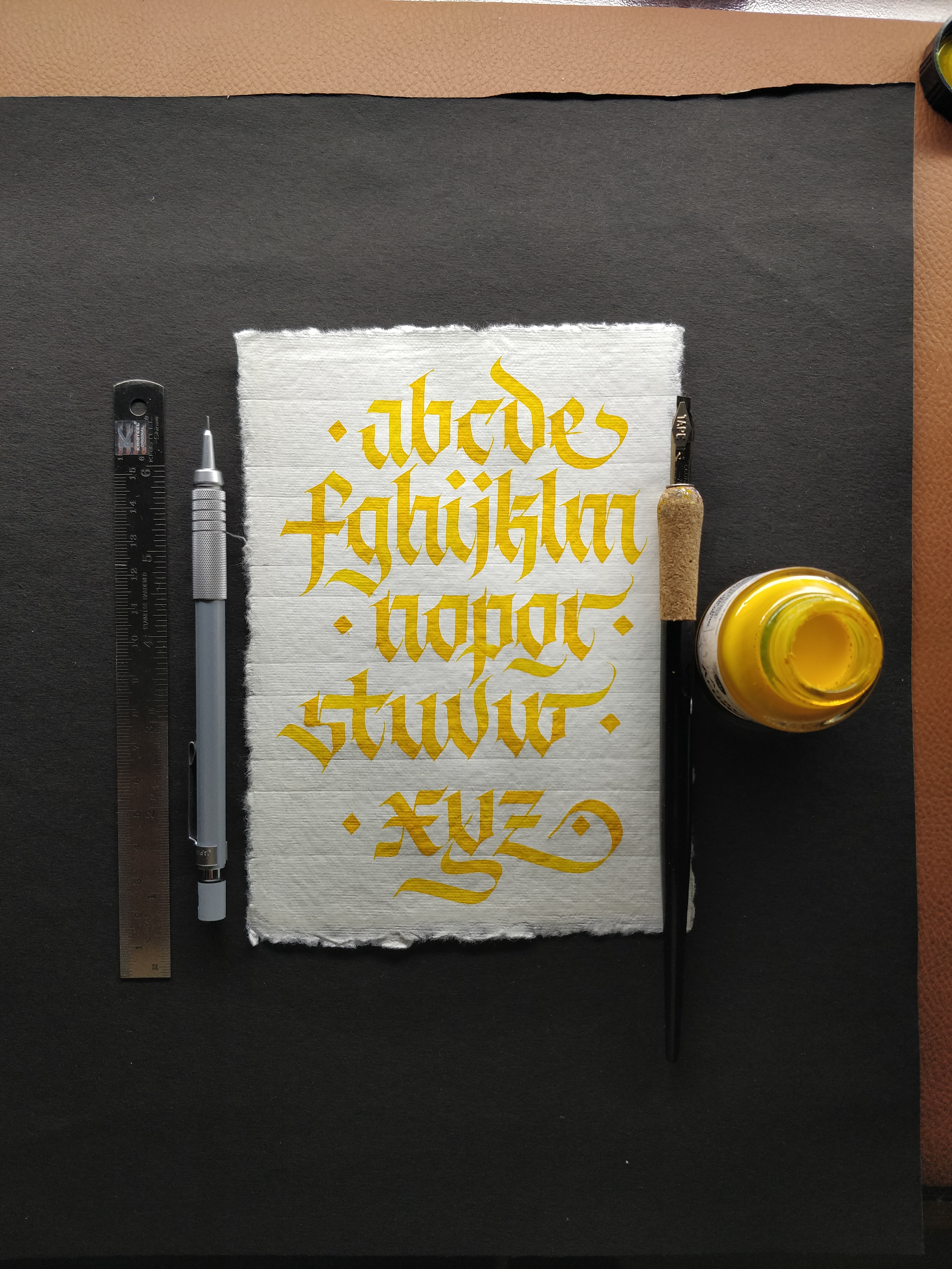
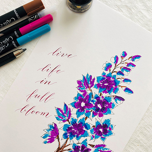
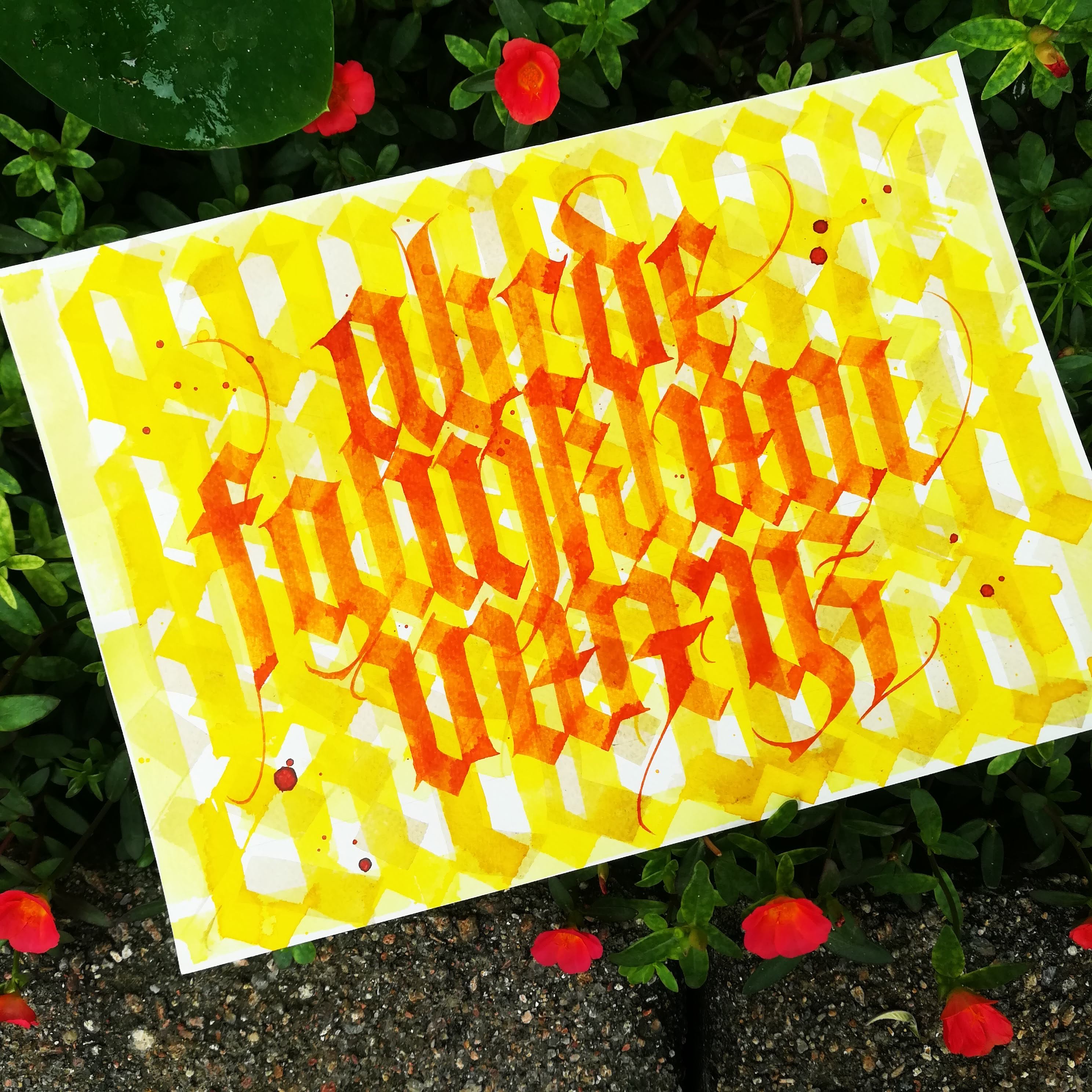
Step 4 - Create your contrast calligraphy
For our focal calligraphy piece we decided on a calligraphy alphabet. Using a pencil sketch out your calligraphy wording and then take a smaller poster nib and write our your calligraphy. We have used a great contrast colour here to make the words stand out. Take a look at the result here:
Step 5 - Adding effects
Your can add some interesting effects to your lettering like shadows using our grey italic markers.
Step 6 - Creating a focal point
You can either leave it there or add a final touch! Using a Roundhand nib and some black ink create your final statement!
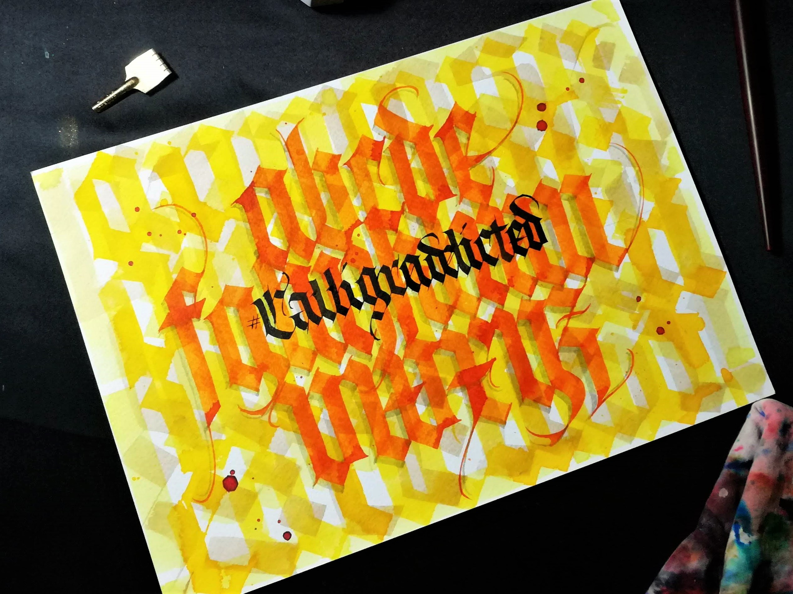
And there you have it, your completed piece. We have used a gothic calligraphy script for our design but you can use any style whether its copperplate, italic, textura, brush or even hand lettering! Get creative and see what you come up with!
To see more of Akhilesh's work you can follow him on Instagram. Remember to follow @manuscriptpenco on Social Media where we will be showcasing his work throughout the month.